As you might’ve gathered by our pointed use of quotation marks in the title, this is a topic with some nuance to it. What makes for good website design? The short answer would be, whatever design endears the person looking at the website to it. Working around this metric is, unsurprisingly, impossible. However, it is possible to know your audience in the broad strokes and this is why it is important to ensure that your website design is ‘good’ for the market you are operating in.
For the purposes of this article, we will be looking at Fitness Club, Gym and Personal Trainer website design.
For starters, here is a quick checklist/summary, detailing some of what we will be covering today.
- Logo: Ensuring that the branding of your business is correct and prominent. That your logo and other branding elements are striking and not overpowering
- Structure: The sleekest website in the world isn’t worth a dime if your members or potential members can’t navigate to where they need to be. It cannot be overstated that a vital part of design is usability. Don’t put style before substance.
- Interaction: Make sure there is something they can click or engage with on the page. Something as simple as a ‘Find Out More’ button is a surefire way to increase engagement and will be a useful indicator as to whether your design is effective.
- Description: Ensuring that the descriptive aspects of your website are well presented and well written. Ensuring that the prose is precise and evocative, to best communicate your brand and it’s message. Think about what your potential customers want to read to hook them in, and then make sure that prose is formatted in a style that will draw their eyes.
- Imagery: Prose is vital but if your website looks like it comes straight out of 1995 then it isn’t likely to win awards. Striking, relevant imagery will capture your audience. Think what your potential club members want to see. Is it your workout equipment? Your facilities? Your sauna?
The Fundamentals of Effective Website Design
Notice that we’ve used a better word? We will be switching back but it is to reinforce a point. What we classify as ‘good’ is what is effective. At its core, you want your Website Design to be intuitive. Ideally, the only thought you want them having is ‘This is a well designed site’, but it is also a victory if it catches their eye and allows them to understand your business and the services it provides.

Use Website Design to make your Product Understandable
What is the purpose of your website? How can you communicate that purpose as succinctly as possible?
These are big questions, but they are the questions you need to be asking. Once you understand the purpose. Think about the target audience. Dream scenario, what type of people do you want to be landing on your website. What do you want them to understand about your product? How best to communicate to those different types.
This is where planning is invaluable. Make a list of different archetypes. For fitness clubs, these archetypes are, luckily for us, fairly well defined. Once you’ve listed these, work out elements of popular web design that are likely to appeal.
It is important to note that none of these need to be permanent. One advantage of modern website design is adaptability and versatility. If you find your business aims shifting, or even come up with a new service, or just a new perspective. It can be incorporated into this system.
Ensuring that your product is understood will be one of the key metrics we use to measure ‘good’ (Effective) website design.
Use Website Design to emphasis why your product is useful
We might be going back to business 101 here but we did say it was the fundamentals and this is a mistake we see too many websites making.
In an attempt to catch the eye, they forget to sell us the product or service.
A product or service needs to be wanted and to be wanted it needs to be useful, your potential customer needs to understand why it is going to make their life better.
When applying this to Gyms and Fitness Clubs, you need them to understand why your club is better for them than another club, or pursuing their fitness goals at home. This is where glowing reviews about your classes and high definition pictures of your gym equipment in use will help carry the day and convince them you have a business they want to be a part of.
Aesthetics and Website Design for your Gym or Fitness Club
Aesthetic is a word thrown around a lot these days. It has become a catch-all term for pinterest boards and thrift shops everywhere. But it has a place in our website design fundamentals.
 Purpose and functionality are the bedrock of your site. Aesthetic is where you really get to show off. Thankfully when it comes to the topic of fitness clubs and gym website design, we are spoiled for choice. Gym-goers have a natural aesthetic beauty to them, our nature sensibilities lead us to find the young, the muscular and the athletic intuitively aesthetic.
Especially if they are mid-way through using some of your striking and top of the line gym equipment. By either hiring a professional photographer for a day or using existing photographs taken by you or your members, you can easily get some great source material to incorporate into your website’s aesthetic.
This philosophy needn’t terminate at muscles and heavy weights though. If your club or gym has striking features, say a sauna, a swimming pool, or even a particular nice facade outside. Capture it and incorporate it into the design of your website.
Website Design Specifics for Gyms and Fitness Clubs
Okay, so now we have the broad fundamentals down. Let’s get specific. In this latter section we will be covering three distinct areas.
- Your Home Page/Landing Page
2. The Rest of your Content
3. Your Overall Display (including continuity between the two).
Each of these areas present their own challenges and opportunities. We will be exploring each in turn with specific focus on how they can relate to a Gym’s website design or a Fitness Club’s website design.
This will allow us to explore the specifics of each key part of a website and how it all blends together.
Okay, now we have the fundamentals down and our mission statement. Let us get started on the basics of website design for Gyms and Fitness Clubs
Your Checklist: Five things your home page or landing page can’t be without.
This list isn’t comprehensive but it is designed to take you through five of the most important things you should be considering for your home page or landing page.
Your Branding Element
As discussed earlier in our section on the principles of ‘Good’ website design for a fitness club or gym, your branding on your landing page is of utmost importance.
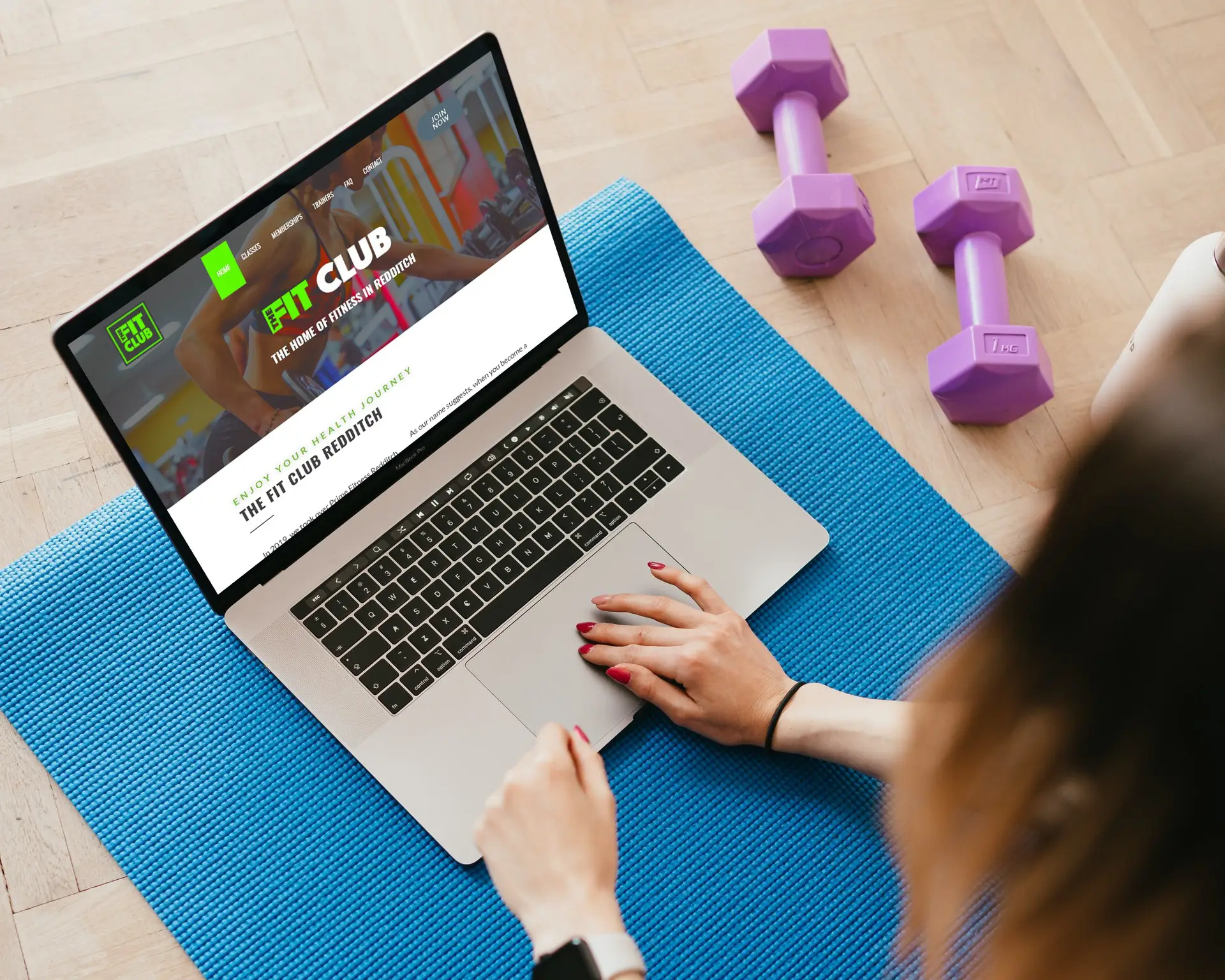
![]() Think of a website you use frequently. Google, Amazon, Netflix. You’d instantly recognise if you went onto Google and everything was Purple and Black. The importance of a unifying and professional look for your site cannot be overstated and you begin forging this brand identity on the first page that your potential customers and consumers see initially.
Think of a website you use frequently. Google, Amazon, Netflix. You’d instantly recognise if you went onto Google and everything was Purple and Black. The importance of a unifying and professional look for your site cannot be overstated and you begin forging this brand identity on the first page that your potential customers and consumers see initially.
In most cases you’ll want the logo in the top left or the top centre. Everyone has a set of expectations and rules they expect to see a website, even if they aren’t aware. The visual language and etiquette that someone responds to is deeply ingrained.
As such, you need to be both striking and familiar. They need to effortlessly navigate to your logo and understand the website they are in, essentially without thinking. By making your website’s colour scheme the same as your logo, you will be further ingraining that pattern of thought within your consumer from the first minute of their visit onwards.
A Good Description
A good logo isn’t the be all and end all though, without clear description it will exist in a void. What does your specific logo mean to someone who has never seen it before? Most likely, nothing. This is where your Logo and Branding Elements for your gym or fitness club will be supported by well written prose in an eye-catching style.
Ideally next to your logo should be a stylised version of your Gym, Fitness Club or overall brand identity. If the name doesn’t give a clear indication of your business/service, then add the necessary words underneath your brand name in a separate, but equally striking font.
During these opening stages of a customer journey, it is of paramount importance that every piece of vital information is accessible with the least frustration possible. That means that it must be visually pleasing, easily identifiable and prominently displayed.
If your visitor struggles to understand what the company that runs this website is, or even worse if they sense that it is lazily or unprofessionally laid out, this is a psychological blow that may make them navigate away.
Engagement: How to grab your visitors with a call to action.
Everything you do in business has a purpose. And your website’s landing page or home page is no different.
What is the purpose of your landing page or home page?
To make your new visitor want to see more.
A tried and tested way for achieving this is the call to action. Challenge your visitor. Ask them a question or make a powerful statement that’ll grab their attention and have them clicking on the button beneath to see more
For an example of a grabbing question you could have:
Are you ready to take your fitness to the next level with our top of the line equipment?
If you want them to read a specific blog, thinkpiece or eBook, then here is an example:
Available now, our latest blog on returning to the Gym post Covid-19
Or
Grab our eBook of workout techniques and post-workout recovery tips, crafted especially for the equipment and facilities at our Gym. Available for free, now!
If your aim is to get them to sign up to a mailing list or a newsletter, consider
Do you want the latest tips and tricks from our experts straight to your MailBox, sign up to our free Newsletter today right here!
Or it could be as simple as:
Why wait, click here to get in touch today.
These are just a few examples to get you thinking along the right lines. Each of these questions would have a corresponding button either built into the question itself, or beneath it with text that represents a positive answer to the question.
Moving forward we hope to make a blog and a guide dedicated to helping Gyms and Fitness Clubs up their copy game to make it more eye-catching, engaging and impactful.
Sensible and Obvious Website Navigation
This point has actually pervaded the entire article, making it all the more important to highlight it in it’s own section. All of our effort so far and below will be for nothing if your visitors do not know where to go.
The reason the challenging question above is so effective is because it gives the visitor not only something to think about, but a very obvious path to take next. If they are engaged with the question, they will click the associated button.
But it doesn’t end there.
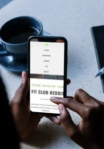 Again, going back to our discussion on visual language and etiquette. Visitors expect to see a top bar of categories that will help them swiftly navigate your gym or fitness club website.
These categories could be as broad as ‘facilities’ or as niche as ‘Our History’, to help them get to know the story of your gym or club.
Sensible navigation becomes less important as your visitor scrolls down your page. At that point your prose should be doing the work!
With that being said, you will still want the occasional link if it seems intuitive.
Once y
our visitor has hit the bottom of your article/landing page/home page, you want to give them as many navigational tools as they had at the top.
If a visitor gets to the bottom of your website and there is nothing to entice them further, chances are that that is the end of your visitors’ vi
sit to your website. Now they aren’t a visitor, they are a goner.
With simple prompts at the bottom of your page you can increase engagement dramatically.
The good news is that if a visitor has gotten to the end of your landing page for your Gym or Fitness Club, their engagement level is likely to be, on average higher than that of the average visitor at the top of your page.
This should make capturing their attention further with buttons and navigational tools all the easier.
An Eye-Catching Visual Element
This section is extrapolated from our principles of effective website design for a Gym or Fitness Club. As you’ll hopefully remember, we focused on pictures and visual imagery. This is important on your landing page as the photographs your visitor is immediately exposed to will set the tone moving forward. Here are some pertinent examples:
- An image, photograph or infographic that represents your Gym, your Fitness Club or your core messages and values.
- A photograph or series of photographs that show the service you provide, people utilising that service and the positive effect it is having on them.
- A photograph or set of photographs that show the more personal side of your Gym or Fitness Club. Tell a story in a few pictures that make your club more than just another name.
If you take one thing away from this section on Landing Pages and Home Pages for Gyms and Fitness Clubs, it is that first impressions really do count. As such, make sure that the pictures you display on your website are of the highest quality you can muster. Smartphone pictures might not make the cut!
The Rest of Your Content
So you’ve got a striking Home page and/or Landing Pages. This is their entry into your site. Now we need to work on the rest of the website for your Gym or Fitness Club.
The good news is that if you’ve got this far, the visitor to your site is probably engaged. Now you need to decide what the rest of your site is going to look like.
One rising school of thought has started to get rid of additional content all together. This is known as the One-Page website and it essentially boils down to all of the information being presented on one long, well formatted, scrolling web-page.
This has advantages and disadvantages, as you can imagine. One clear advantage is the lack of disconnect between information. One challenge we discussed earlier is that when the page runs out, this is a danger zone for your visitors attention span. This doesn’t happen one a one-page website but that doesn’t mean it lacks issues.
It’s important to consider the amount of information that you feel a reader can absorb. If you are confident that you can fit this information into a few bite-sized chunks or concise sentences, you can certainly go ahead and put it all on one page.
But our principle regarding navigation might suffer. Navigation tools help direct your visitors to the information they want to see. If they have to scroll endlessly to locate and even revisit certain points, this is a level of tedium that might prove too much.
With that out in the open, here are some of the sections you’ll want to have in your website, whether it is on one page or multiple pages.
Your About Us/Our History Page
We mentioned this earlier but an About Us page or a page that goes into ‘the Story’ of your Gym or Fitness Club is really a must. This is somewhere visitors have been proven to seek out. What better way to get an overview of the institution you might be joining than to know when they started, why they started and who started them.
This is a chance for your gym or fitness club to become a relatable, personal institution to them for the first time. Do you have a funny founding story? Some lovely photos of the first days setting up the Gym? Some characters that really made an impact? Here is where to put them in an environment where receptive visitors will find them.
Your Reviews, Testimonies and associated ‘Buzz’ Page
This page needs no introduction. Whenever we receive a positive review, our first instinct should be to put it up in lights along with all the other ones. This page will allow you to collect these heartfelt and genuine reviews and experiences.
If you are undertaking a project, ask your existing members for their experiences in your gym or fitness club. They are bound to have some stories to tell!
Your Contact Us Page
Another page that will be conspicuous if missing. A generic Contact Us page will be necessary for sealing the deal on many visitors who might be turning into members. Remember to include a map so that they can quickly ascertain whether your Gym or Fitness Club is in the right location.
Your Equipment, Facilities and Resources
Your Fitness Club or Gym has to make a difference to your customer’s life, and this is where you really get to flex how you can help them transform their existing routines, workouts and bodies.
A Space for Blogs, Think-Pieces and Articles
This space, properly cultivated, can be a big draw to your Gym or Fitness Club. This is a place to put all of your experience, expertise and knowledge. Through the medium of a blog, you are able to refine difficult concepts into easily digestible reads for your customers. Impart advice, give your staff and customers a voice and create valuable content to help guide any visitors that stumble across your website.
Bringing It All Together
So, now we have spilt a lot of digital ink on the subject of Good Web Design and Content for your Gym or Fitness Club?
Have you noticed any underlying patterns?
Good web design is about minimising the time between a potential client or customer clicking on your page and them receiving and understanding the message you want to deliver.
Every aspect of Website Design we have covered here goes into this in one way or another.
If your website design is effective, the only time your customer will notice it will be when they are marvelling at how well put together your website is. The rest will just allow for seamless and naturalistic navigation to the information that they care about.
We Can Help You
Now you are equipped with the principles of good (or effective) website design and many examples of how to implement these.
But this guide is only the beginning, and website design is only one piece of the whole that is running a successful Gym or Fitness Club.
There are many things you need to have under control, marketing, software systems, payment, collection, retention strategy. The list can seem daunting, especially when you’ve got to run BAU.
Well, Ashbourne Membership Management might have the solution.
Get in touch for a full demo of our software, our principles on website design or to simply have a conversation about how we can help you and your gym achieve its full potential.